Pages

Changes, changes.


I have come to a realisation - lately I've been making a lot of changes in a short space of time! I'll include it all in this post; further changes, naturally, will be included in future posts.

First up - my price list. I've tweaked a few prices here and there in order to simplify things and make the decision-making process so much easier. These prices account for time, quality of henna (remember, I enjoy and prefer mixing my own; I won't hesitate to tell you what's in it. I'm also looking around to try different henna powders, all organic of course), punctuality and atmosphere of your appointment. Not to say that I'd give a lousy appointment for a small booking! With good care (I provide printed instructions for you to refer to), the results are good ;)

Second - my bridal packages. There used to be four tiers (bronze, silver, gold and platinum); now there are only three: silver, gold and platinum. The prices are so much better. This is all in the process; there may be further changes in the future but for now, three choices instead of four makes things way easier. The designs are more striking and unique; I'll put some up in my next post for you to see; I hope you'd love them!

Third - I've been making changes to this site; it's all to make navigation and clarity most convenient. Some days some elements may be there, other days you'll see it might be removed (for example, I had a Google Form on my 'Contact Me' page, but I had to keep manually checking for updates and if someone needs a prompt answer, it's not a good option at all). It's just including what works. I feel that e-mail is the best option at the start because you can send me a few examples of pics you've seen that interest you, and I can work around those. (I won't copy, unless you're completely in love with that particular design). You can also include all the questions you'd like to ask - don't be afraid if you feel like it's an essay! The more you specify what you're looking for, the better. You aren't tied to just e-mailing me at first though, if calling me or sending me a message is better for you, go ahead.

Fourth - my portfolios are expanding. I have two; one for individual appointments and quick festival designs, another for bridal designs. There are designs moving up the ranks, others are moving down, and some are being scrapped completely.


A sangeet strip for an individual appointment. You can see traces of older henna -
I just can't wait to get started with the next design!

Good communication is essential and I would love for you to keep in touch - subscribe to my posts via e-mail to be notified of more changes, additions to the site, and even just to view my work. (That's most of the essence of this site!)


A full, free-form sleeve.


Don't these tempt you? :D


Which nail colour to choose? (Decisions)

Ahhh, decisions, decisions. There will come a time in a girl's life where she asks, "Which colour should I choose??"; mostly, "which colour is best to use with my design?" Hopefully this post could simplify things a bit...or at least inspire your good judgement.


We begin with our design - this may be a doodle, and only a day old, but I felt it was sufficient enough for a demonstration.


This is a one-day-old design. And I wash my hands quite a few times a day.


Purple! I used 'Sinful Colours' (cleverly disguised as 'PASSION' on the cap, I saw the remnants of 'Sinful Colours' on the bottle) and the shade was unspecified. Loved how it looked in the bottle though; there's something about the royal purple that appeals to me. The red tones seem to pop out with this colour. I needed three coats for this one for it to look substantial.

Damson...in distress?


Next up we have black, with a shimmer of blue glitter. The glitter offsets the black colour and doesn't make it look so harsh. It has a certain allure to it. It also highlights the reddish tones. This is also Sinful Colours/PASSION. One coat, and all was well in the world.

Alluring indeed.

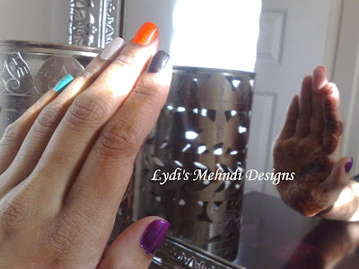
Now this one quite fascinated me! Brings out the orangey-red tones. The neon orange looks magnificent (especially the moment I was attracted to it in-store), and I was under the impression that it was a gloss finish. It dried matte and I was so thrilled! Another Sinful Colours/PASSION production, with the shade unspecified. We'll stick to neon orange.


An elegant white. This shade is 'Mayfair', by 'Nails inc.'. It's beautiful and pearlescent. It contrasts well against the reddish tones of the mehndi. Two coats to set the score straight.


This is one of my favourites to use; it's 'Seven Dials' by 'Nails inc.' Smooth finish; never disappoints. Brings out the deeper brown tones. One coat's all you need.


 On a final note - if you simply can't decide which one to use - use 'em all!


Probably the coolest shot I've ever taken. Also, modesty is one of my strong points.


Laying the cards (or colours) on the table.


All together now!

Personally, I love them all, but the pearlescent white wins because it brings out the reddish tones of the mehndi. Which one do you think wins?


Introducing new bridal designs; and a new portfolio!

Last night I decided I'd better sit down and take a good look at my portfolio. I asked myself, 'does it appeal to brides? Does it appeal to people who love traditional, modern, or fusion designs?' An entire revamp was needed so I sat tirelessly, sketching the ideas that came to mind. Out with the old, in with the new! This is a preview of my new portfolio...I'd love your opinion on how these designs will be received!


This is the first of the more detailed designs; this is Indo-Arabic fusion.


Matching sets of designs are usually the way to go; contemporary brides may disagree ;)


Concept art is important because it shows your entire journey from start to finish.


The journey's going quite well! I love the way they're turning out.
If you're a bride-to-be and you like what you see, you know what to do! Come on over and make that booking!

The stain after 24 hours, as promised!


 Doesn't my mum-in-law (to be) love me or what! :P


Okay, it still looks like a hot mess! ...but I'm quite happy with the colour.


There are more examples of my work here:
"Lydi's Mehndi Designs"

Are you ready for more stain photos?

Mixing new batches of mehndi always intrigues me, especially when the stain is even better than before! Last night I decided to do some drawings, so here they are.


 I can never decide on one particular design, especially when I don't have my final design drawn out in front of me.


 The next morning, straight after paste removal, I got my design looking like this. It looks like a hot mess, but darkening a lot more will clarify it.


Six hours down the line (after paste removal and good care), this is what I ended up with. In my next post, I will show you what this stain looks like in about 24 hours' time. Do you like this stain? Come on over, make your booking with me! My details are in the 'Contact Me' tab right at the top. I look forward to seeing you!

A new design; simple...yet bold

Here is a new design, created while I was drawing up a larger bridal design. I sidetracked a bit, and this design popped up out of nowhere.


It is simple, yet bold. We had our family over after my cousin (more like a sister), Chardae, tied the knot last weekend! I modified this design to contain hearts instead of loops as her bridal design (she didn't want anything too detailed), but we didn't get to see each other in time for me to actually do the design. The wedding was heavenly, regardless! When family was nice and comfortable here at home, I was helping to clear up and everything, and the mehndi began to fleck off in places, so I dusted it all off after about an hour.


Not too bad, considering this took about 20 hours to darken to this colour. (The little design on the left was added in the evening, but after about 5 minutes after I applied it, I smudged it. Careless! So I had to tissue it off. I thought it would never darken.)


I just had to take this, didn't I! It reminds me of the conversational moustache Amy used in 'Big Bang Theory'...well, close enough :D

My first facelift! (and a surprise)

You read right! ...it's a facelift of this blog, though ;)
By the title you're probably thinking, "The facelift wasn't the surprise??" It's about time it needed a fresh, cleaner look.

Now, on to the surprise!

I'm releasing a glitter package to complement my mehndi packages! It's still work in progress, but I'm excited at its arrival.


I will be using only cosmetic grade, polyethylene terephthalate glitters - polyester, as a less tongue-twisting name. I'll never use the R5 glitters found at the Chinese store on the skin! (It's all love though. Their colours are so pretty.)

So come on over and get your henna done! Glitter is a gorgeous addition to any design.

Click those share buttons!