We begin with our design - this may be a doodle, and only a day old, but I felt it was sufficient enough for a demonstration.
 |
| This is a one-day-old design. And I wash my hands quite a few times a day. |
Purple! I used 'Sinful Colours' (cleverly disguised as 'PASSION' on the cap, I saw the remnants of 'Sinful Colours' on the bottle) and the shade was unspecified. Loved how it looked in the bottle though; there's something about the royal purple that appeals to me. The red tones seem to pop out with this colour. I needed three coats for this one for it to look substantial.
 |
| Damson...in distress? |
Next up we have black, with a shimmer of blue glitter. The glitter offsets the black colour and doesn't make it look so harsh. It has a certain allure to it. It also highlights the reddish tones. This is also Sinful Colours/PASSION. One coat, and all was well in the world.
 |
| Alluring indeed. |
Now this one quite fascinated me! Brings out the orangey-red tones. The neon orange looks magnificent (especially the moment I was attracted to it in-store), and I was under the impression that it was a gloss finish. It dried matte and I was so thrilled! Another Sinful Colours/PASSION production, with the shade unspecified. We'll stick to neon orange.
An elegant white. This shade is 'Mayfair', by 'Nails inc.'. It's beautiful and pearlescent. It contrasts well against the reddish tones of the mehndi. Two coats to set the score straight.
This is one of my favourites to use; it's 'Seven Dials' by 'Nails inc.' Smooth finish; never disappoints. Brings out the deeper brown tones. One coat's all you need.
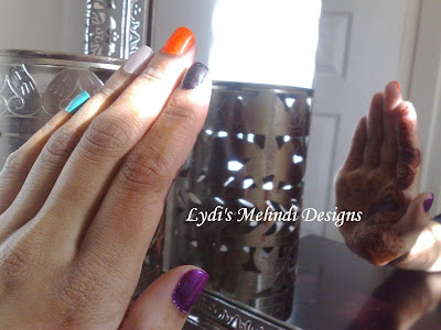
On a final note - if you simply can't decide which one to use - use 'em all!
 | |||
| Probably the coolest shot I've ever taken. Also, modesty is one of my strong points. |
 |
| Laying the cards (or colours) on the table. |
 |
| All together now! |
Personally, I love them all, but the pearlescent white wins because it brings out the reddish tones of the mehndi. Which one do you think wins?


